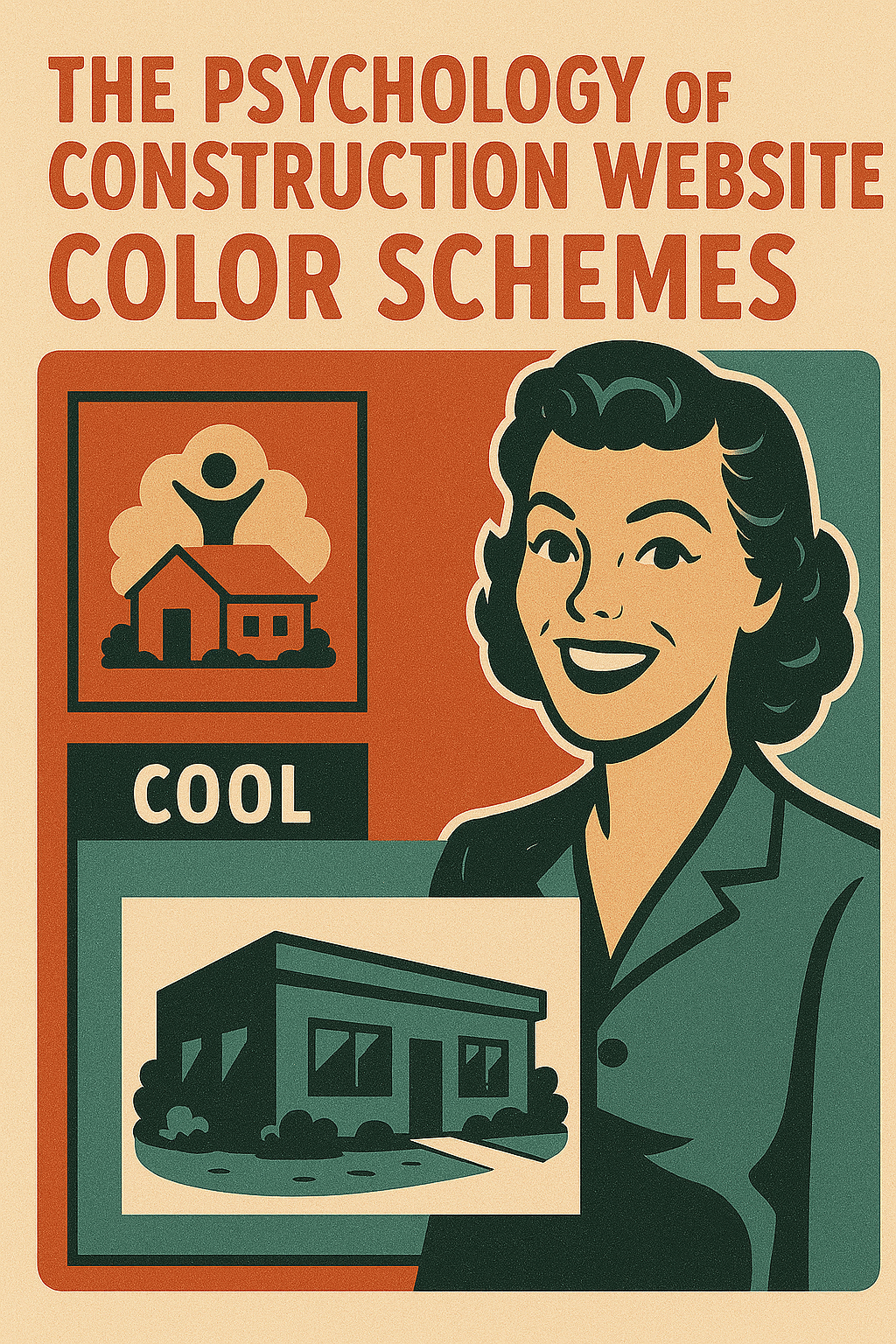
Ever noticed how most construction websites look like they raided the same paint store? Blue here, orange there, maybe some gray for good measure. It’s not just coincidence – there’s real psychology behind why these colors dominate the construction industry online. But here’s the kicker: sometimes breaking these color “rules” can set your business apart in all the right ways.
Why Colors Matter More Than You Think
Your website’s color scheme is like a firm handshake – it makes a first impression before visitors even read a single word. In construction, where trust and reliability are everything, colors speak louder than any testimonial could.
Think about it. When someone’s looking for a contractor to build their dream home or renovate their office, they’re making a huge financial decision. The colors on your website are sending signals about whether you’re the right fit, often on a subconscious level.
Research shows that people form opinions about a website in as little as 50 milliseconds. That’s faster than you can blink. And color plays a massive role in that split-second judgment.
The Blue and Orange Dynasty in Construction
Walk through any construction trade show or flip through contractor websites, and you’ll see blue and orange everywhere. There’s a reason these colors rule the roost.
Blue is the trust-builder. It signals stability, professionalism, and reliability – exactly what someone wants when they’re handing over tens of thousands of dollars for a project. Navy blue feels established and traditional. Lighter blues feel modern and approachable. Either way, blue says “we’ve got this.”
Orange, on the other hand, is the action-taker. It’s energetic, confident, and stands out without being aggressive like red. Orange says “we get things done.” It’s the hard hat of the color world – practical, visible, and ready to work.
Together, blue and orange create a powerful combo. They’re complementary colors, which means they naturally look good together. Blue handles the trust factor while orange brings the energy. It’s like having a seasoned project manager and an enthusiastic crew chief on the same team.
The Hidden Psychology Behind Construction Colors
Colors trigger emotions and associations that run deeper than we realize. In construction, certain colors tap into specific feelings:
Gray and Silver suggest steel, concrete, and modern building materials. They feel industrial and sophisticated. Use them when targeting commercial clients or high-end residential projects.
Brown and Tan connect to wood, earth, and craftsmanship. They work great for custom builders, restoration specialists, or anyone emphasizing traditional building methods.
Green is having a moment in construction, thanks to the sustainability movement. It signals eco-friendly practices and forward-thinking approaches. Perfect if you specialize in green building or energy-efficient construction.
Black adds premium feel and sophistication. Used sparingly with other colors, it can elevate your brand from everyday contractor to luxury builder.
When Following the Crowd Hurts Your Business
Here’s where things get interesting. While blue and orange work well, they’re also everywhere. If every construction website in your area uses the same color palette, how do you stand out?
Sometimes, breaking the color rules is exactly what you need. I’ve seen construction companies succeed with unexpected choices:
A concrete contractor used purple and white to stand out in a sea of gray competitors. The purple suggested creativity and innovation – perfect for their decorative concrete specialty.
A home builder targeting young families chose bright teal and coral. These fresh, modern colors appealed to millennials and made them memorable at home shows.
A commercial contractor went all-black with gold accents. The luxury feel attracted high-end clients willing to pay premium prices.
Choosing Colors That Work for Your Market
Your ideal color scheme depends on who you’re trying to reach. Consider your target market:
For residential contractors: Warmer colors like oranges, yellows, and earth tones create a friendly, approachable vibe. Homeowners want to feel comfortable with you.
For commercial contractors: Cooler colors like blues, grays, and blacks project professionalism and efficiency. Business owners care about competence and reliability.
For specialty trades: Don’t be afraid to get creative. If you’re the only terrazzo installer in town, why look like every other contractor? Stand out with colors that reflect your unique craft.
Making Your Color Choice Work
Picking colors is just the start. Here’s how to use them effectively:
Keep it simple: Stick to 2-3 main colors max. Too many colors look chaotic and unprofessional.
Test on different screens: Colors look different on phones, tablets, and computers. Make sure yours work everywhere.
Consider accessibility: Some color combinations are hard to read for people with vision issues. Tools like WebAIM’s contrast checker can help.
Stay consistent: Use your colors the same way across your entire website. If blue is for headings, keep it that way throughout.
Think beyond the website: Your color scheme should work on trucks, business cards, and job site signs too.
Breaking the Rules the Right Way
If you’re ready to ditch the blue-and-orange playbook, do it strategically:
- Know your why: Have a reason for your color choice that ties to your brand story
- Test with real people: Show your color scheme to existing clients and see their reaction
- Keep one familiar element: If you go wild with color, keep your layout traditional
- Document your choices: Create a simple guide so everyone uses colors consistently
Your Colors Tell Your Story
At the end of the day, your construction website colors should reflect who you are as a company. If you’re innovative and cutting-edge, show it with bold, unexpected colors. If you’re the reliable, traditional choice, classic blues and grays might be perfect.
The best color scheme is one that authentically represents your business while appealing to your ideal clients. Sometimes that means following the proven path of blue and orange. Sometimes it means painting outside the lines.
Want to know if your website colors are working for or against you? Get a free homepage review to see how your color choices stack up. Or dive deeper with our comprehensive 10-point website checkup that examines everything from colors to conversions. Your perfect color scheme might be just a few clicks away.